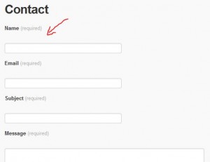
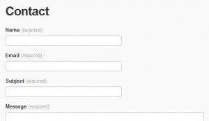
On a WordPress blog, when using the Jetpack contact forms ([contact-form] tag), you may see some useless empty lines. To work around this behavior, edit the CSS (Dashboard > Appearance > Edit CSS) and add this code:
|
1 2 3 |
.contact-form br { display: none; } |
Technical explanation
I checked in the HTML code of the result and found out a small “<br>” generated between each “<label>” and “<input>”. Why is it here ? I don’t know, maybe one day I will ask the Jetpack developers.
|
1 2 3 4 5 |
<div> <label for="g14-name" class="grunion-field-label name">Name<span>(required)</span></label> <br> <!-- The evil <br> is here! --> <input id="g14-name" value="" class="name" type="text"> </div> |
First, I tried to edit the CSS properties of the “grunion-field-label” class. Unfortunately, the changes are interpreted before the CSS file of Jetpack (called “grunion.css”), so they are not considered. The workaround I used was pretty simple: instead of focusing on the label, I make the “<br>” disappear.
|
1 2 3 |
.contact-form br { display: none; } |
As long as the CSS class of the form will be “contact-form”, this small trick will work.


By Adrian 01/10/2020 - 01:44
dear Nicolas Form, thank you, you saved me hours to fix this weird issue 🙂
By Nicolas Form 02/10/2020 - 13:18
You are welcome 🙂